Rethinking the Google search bar
To thumb or not to thumb, that's the question


Photo illustration by Thomas Trutschel/Photothek via Getty Images
Problem statement
All internet browsers have one thing in common - the search bar is located at the top. That works if you’re on a desktop. Meanwhile phone screen sizes have become larger and larger, but humans haven’t adapted to that change. Our fingers haven’t grown larger, nor have our hands become bigger, right? This makes it harder for us to reach to the upper part of the screen to navigate and interact with the browser, which can be tedious. That’s where our proposed solution may prove useful.
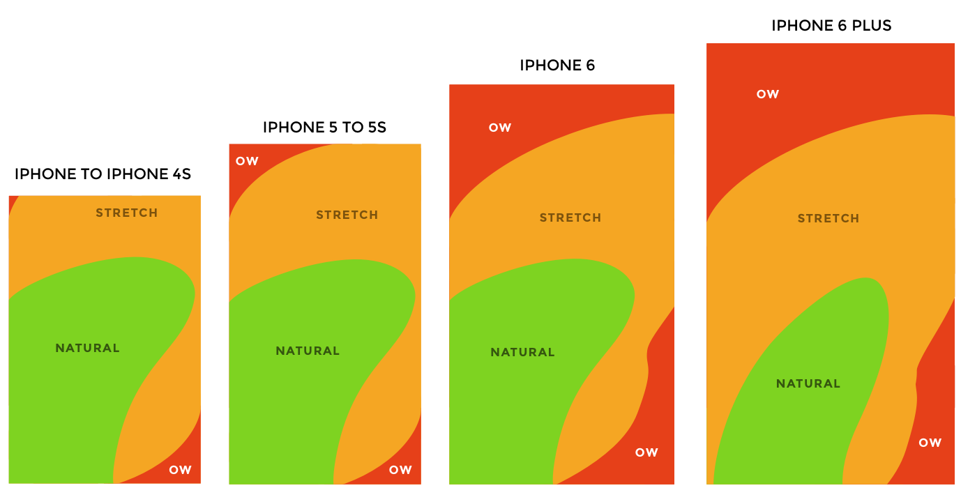
Mobile screens tend to become bigger so it may be hard to reach different parts of the screen with a thumb.
Design solution
A recurring design trend to accommodate for that change has been to move the primary navigation from the top to bottom, so our thumbs can easily reach the navigation buttons so that we as users can complete our tasks and achieve our goals.
“It’s important to place top-level and frequently-used actions at the bottom of the screen, because they are comfortably reached with one-thumb interactions." - Nick Babich (UXPlanet)
To adapt to the quick changes in technology and to accommodate user behaviour, we’ve challenged the traditional way of looking at the browser experience on mobile phones. Instead of keeping the search bar and it’s secondary- and tertiary features hidden in a menu, we’ve decided to flip everything upside down (not literally speaking). Moving the search bar and the features to the bottom. This allows users to navigate on the web quicker and lets user’s reach features previously not easily reachable, like “Bookmarks” or “Translate”.
We have designed two possible solutions for the design problem. Let's have a look at them.
Solution I
Here you can see two states of the design:
- A user pulls the handle one time - and the search bar together with the main menu appears.
- A user pulls the handle twice - and she can see all the addtitional functions in text.
This video illustrates our design solution when Google Chrome functions are in text.
Solution II
Here you can see the same two states of the design but this time the addtitional functions have icons.
This video illustrates our design solution when Google Chrome functions have icons.
Detailed explanation of our design
State I
State I - shrinked view.
State I - standard view.
On the pictures above you can see two variations of how a standard interface can look like depending on user’s settings. The first picture shows almost the exact same interface as it is today except for two differences:
- the whole search bar and all its functions is now at the bottom of the screen.
- three dots in the right corner disappear (the same function is activated when a user drags or presses a handle button on a drawer, we explain it below).
Why?
The reason why we have chosen not to make changes in how the interface looks like is to make it easy for users to recognize it so that they don’t have to struggle to learn something new. After all, the main goal of UX is to make it easier and better for the user and not harder, right?
Example
Let’s say you hold your smartphone normally, e.g. you hold your device with fingers while navigating with your thumbs. You want to search for and navigate to a specific webpage using Google Chrome.
Steps that you have to do now with the existing interface:
- Thumbs at the top. You first need to move one of your thumbs at the top of the page to click on the search bar.
- Thumbs at the bottom. Then you have to move thumbs back to the bottom of the screen to start typing.
- Thumbs at the top. When you start typing you would probably see some alternatives that Google Chrome provides you with so that you don’t have to type the entire web address. So you have to move your thumbs up again to click on one of the proposed alternatives.
- Thumbs at the bottom. It is natural that most of us would move our thumbs at the bottom of the screen again while the page is loading.
Taking into account that the screens tend to become bigger it makes it even harder to move your thumbs up and down all the time.
Now let’s look at how it may work with our design:
- Thumbs at the bottom. A user does everything described above holding thumbs at the bottom of the page all the time - clicking on the search bar, typing the web address, choosing from the proposed alternatives, and waiting while the page is loading.
Feels easier, right?
Our idea is that it is more ergonomic, easier, and smoother for human thumbs to be able to do everything without extra movements than having to move your thumbs at the top of the screen and then back at the bottom, and back at the top again, and then back at the bottom again…. well, you’ve got it!
State II

State II - search bar and main menu.
Another state of our interface - or it may be another version as well - is when a user is provided not only with a search bar but also with some of the most frequent functions that she or he uses. We call it main menu. Our primal thought is that this view appears when a user pulls the handle on the drawer one time. However, there is also a possibility that this state is standard view for the user if she prefers so. Main menu can include for example such function as reload, bookmark, new tab, new incognito tab, download, share, etc for quick access.
Why?
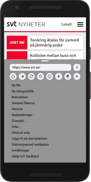
Our vision is that it is up to a user to choose which functions to place in the main menu depending on personal preferences. Like already mentioned above the three dots in the right corner have disappeared in our design. Instead, a user can place most important functions directly under the search bar, i.e. in the main menu. Thus, we have eliminated an extra step when she or he needs to choose from one of the Chrome functions.
Example
You have opened an interesting webpage and would like to share it with your friend.
Steps that you have to do using existing interface:
- Move your thumbs up to the search bar.
- Click on the three dots at the right corner.
- Choose Share.
Steps that you have to do in our design:
- Choose share.
Easy peasy!
State III
State III - expanded view with additional functions in text.
State III - expanded view with icons.
We have also designed one more state of the design, which is activated when a user expands the search bar for the second time. This time it is all of the Google Chrome functions that the user sees.
Why?
We propose two solutions here.
Solution I - text
Except for the icons in the main menu the rest of the Chrome functions are in text. So there is no difference here with the existing Chrome menu. This time the overlay layer takes more space on the screen than in alternative I. Moreover, it is not possible to drag different functions to the main menu but they are already selected for the user by Google.
Solution II - icons
All the functions that are available by clicking on the three dots on the existing interface are made to icons. The icons are supported with text below them for more accessibility. If a user clicks on an icon the function of the icon is activated. The user can also drag the icon to the main menu for quick access. So next time she wants to use this function she would need to click on or pull the handle only once (so that the state II of our design is activated).
It’s not all sunshine and rainbows
Our idea is foolproof, right? Maybe in a dream scenario, but the reality is far from that. As we sketched on the solution we realized that we could have potential technical issues like:
- How will the solution work with websites that rely on a bottom navigation? Will the solution interfere with the interface and cause misclicks?
- In the current iteration of Google Chrome, the top navigation disappears as the user scrolls down. How will our solution tackle that?
- It has been standard practice for browsers to have the search field on top of the webpage, thus users are expecting it to be there.
It would’ve been interesting to explore these issues and delve deeper into solutions, but due to time constraints we decided to limit the scope of the project. If we had more time, we’d also like to work more human-centered, carry usability tests to iterate on our solution and get input from real users.
Summary
For one week we’ve challenged the way we look at web browsers in Android smartphones. We’ve explored the possibility of moving the search bar and its features to the bottom of the screen to help users navigate the web with the help of their thumbs as screens have become larger and larger. There’s still concerns that needs to be addressed, but it’s important that we challenge the way we look at things in order to find solutions to problems in our everyday lives. That’s what design is, right? Solving problems.
Give us your feedback!
We are very keen on getting feedback from you. Please send us your comments and suggestions using the form below.